Credit Card Mobile Website
Canadian Tire Financial Services
Canadian Tire wanted to bring their credit card site to mobile. Simple enough, right?
Here's the thing: just cramming the desktop site into a phone screen wasn't going to work. People use their phones differently than their computers. They're on the go, they want quick answers, and they definitely don't want to pinch and zoom around a tiny version of a desktop site.
So I sat down with the Canadian Tire team and we talked through what mobile users actually need. I showed them different approaches other mobile sites were taking, which helped shift the conversation from "how do we shrink this?" to "what should this actually be?"
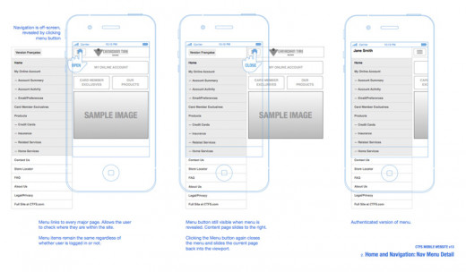
We dug into user data to see what phones people were actually using and how they were using them. Then I sketched out wireframes and designs that played to mobile's strengths—simple gestures, clear hierarchy, easy thumb navigation.
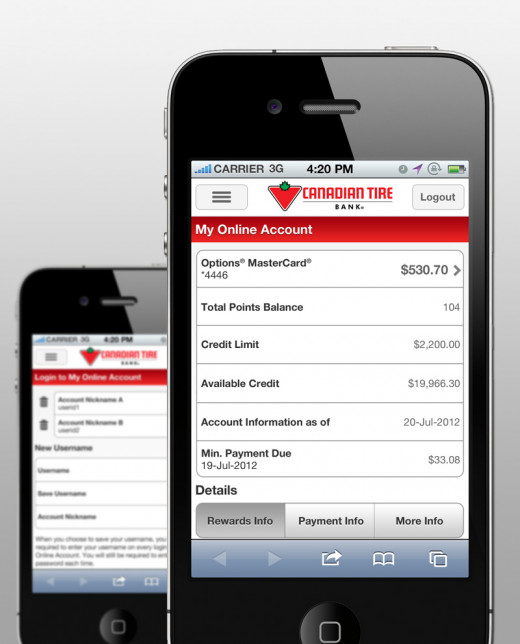
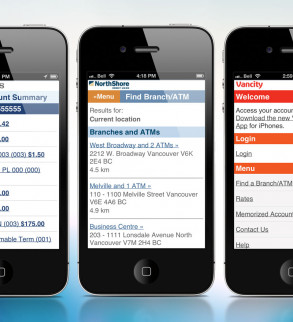
The result was a streamlined mobile experience that actually felt like it was built for phones, not squeezed onto them.