Asurion Service Widget Redesign
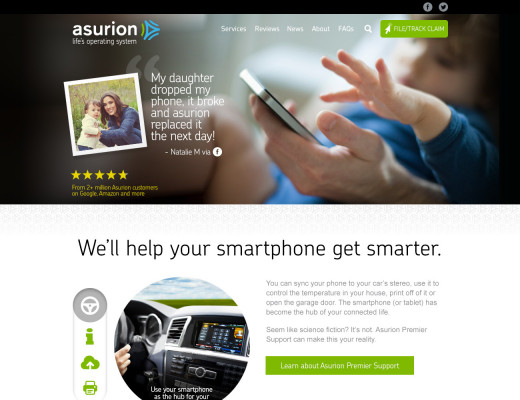
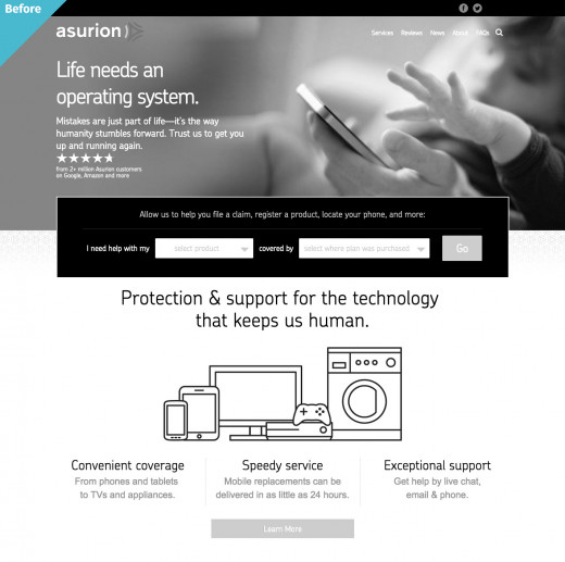
Asurion.com
The "Service Widget" was this little interface element that lived on Asurion.com.
Here's how it worked in practice…
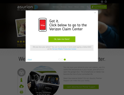
Say you're a Verizon customer who just bought a new phone with a protection plan. A few weeks later, you drop it and the screen cracks. Ugh. Obviously, you want to file a claim.
Most customers head straight to Asurion.com, since Asurion provides their protection plan. Makes perfect sense, right? Here's the catch: the actual claim needs to be filed through Verizon's website.
This is exactly where our Service Widget came in – it was designed to be that helpful bridge, guiding customers to the right place to file their claim.
But we had a problem. Our user research showed that the existing widget wasn't quite hitting the mark. Here's what we discovered:
- The instructions were too brief, leaving users uncertain about next steps
- The interface felt a little cold and unhelpful
- The mobile experience was a little clumsy in spots
These pain points were creating unnecessary stress for customers in the midst of an already frustrating situation.
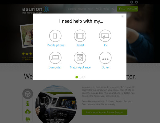
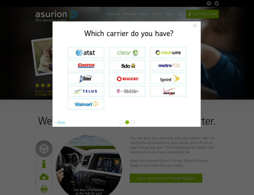
So I took a fresh approach:
- Simplified the interface down to a clear, inviting "File/Track Claim" button
- Designed a mobile-first popup experience that guides users step-by-step
- Rewrote the copy to feel more human and empathetic
The result? A more intuitive experience that actually helps people get their claims sorted without the extra hassle.